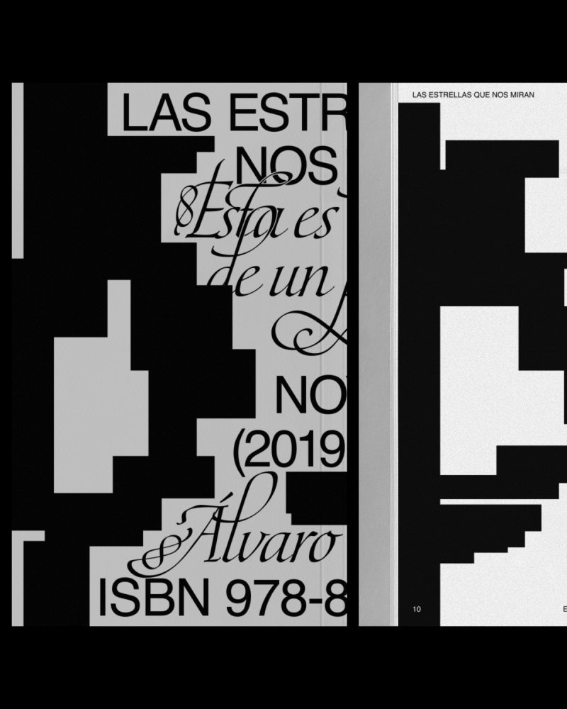


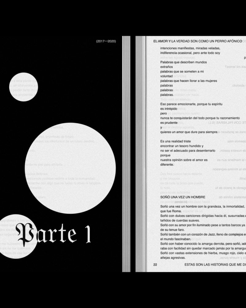


Graphic system design for the publication of all the editorial works of the writer ÁLVARO TALAREWITZ. The book covers are divided into zones where the information is distributed using two contrasting typographies.
The HELVETICA font, common to all books, is used for the title, literary genre, year and ISBN. In contrast, the other typography is used for the subtitle and the author: ÁLVARO TALAREWITZ.
Color and the use of textures are other graphic resources that change and evolve in each book. The graphic system can be seen in two of his works: the collection of poems "EL AMOR Y LA VERDAD SON COMO UN PERRO AFÓNICO" and the novel "LAS ESTRELLAS QUE NOS MIRAN".


JUAN GELMAN's quote "reading is traveling by oneself", the series "I GOT UP" (1968-79) by the artist ON KAWARA or JOSEPH BEUYS compositions have been the source of inspiration to design a writer stamp and some postcards with images taken by ÁLVARO TALAREWITZ. These photographies illustrate the concept of each literary work.


"HAY UN VOLCÁN ENCIMA DE CASA" book and the exhibition's vinyls design; a personal project of PABLO CURTO and ALBA GALOCHA.


After two years, the unpublished exhibition includes the book along with eight embroideries, a dual projection of photographs, fragments of a WHATSAPP conversation between PABLO and ALBA, and the rest of a piece of mud.
As the curator CRISTINA VIVES explains, the project shows two personal stories, painful but empowering, united in a creative process whose main stage is the island of FUERTEVENTURA.
The creative process between N-E and its authors has been nourished by numerous conversations and reflections that have resulted in a delicate design where every detail is important. The book, edited by TERRANOVA, is reversible, it has no beginning or end. The same graphic resources are present in the vinyls of the exhibition.


The MAGABOOK ADG Laus Awards is a publication or, more specifically, a yearbook that compiles the best creative projects in the field of graphic design over the course of a year. From N-E, we go one step further, designing something that is closer to an object and that provides an experience: a box that must be discovered. Thought as "something to keep", the user is forced to dedicate some time to the project, which is still an editorial project.


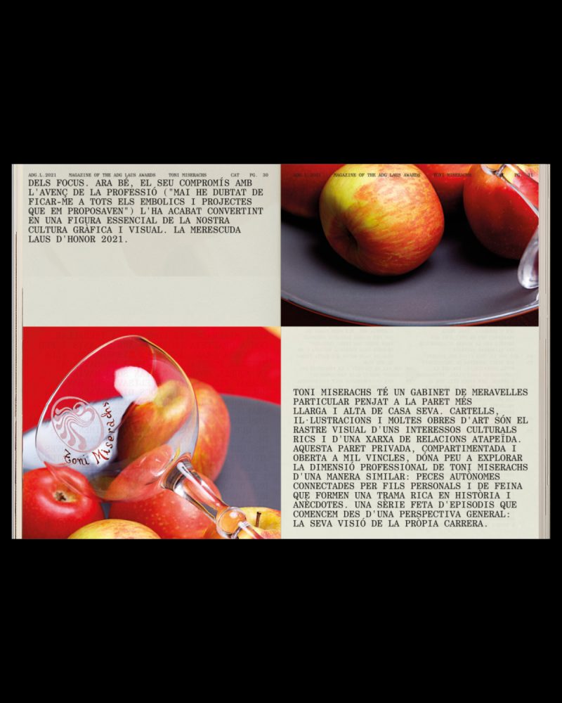
We live in an era where the digital world and the physycal coexist and are increasingly connected. Objects, even through a screen, are still relevant and define us as individuals. This is what GEORGES PEREC tells in his book "LES CHOSES" (1965). Following this discourse, GERAY MENA has collaborated in this project portraying TONI MISERACHS, LAUS DE HONOR AWARD 2021, through them. The images show some details such as earrings or a watch next to other objects that are relevant describing her personality.


From N-E, we developed the MAGABOOK ADG LAUS AWARDS 2021 as a reflection of our time and, therefore, we have rethought the format from its foundation. We are talking about a period in which we have been forced to adapt to new scenarios, rethink the way we work and change the way we interact. A new context where some aspects have been accentuated such as the duality between digital and physical. This sense of bewilderment in the face of a new reality is reflected in the proposal: the reader faces a graphic abyss; must adapt and understand the new codes and rules of MAGABOOK 2021.
The relationship with time is present throughout the project. For this, we have been greatly inspired, both graphic and conceptually, by the work of ON KAWARA (1932-2014). This JAPANESE conceptual artist addressed throughout his life the idea of time and how it passes; showing how it can go beyond and reduce historical experience.
The MAGABOOK project is divided into two publications: the book and the magazine. They relate to the works "DATE PAINTINGS" for the digital part and with "ONE MILLION YEARS" for the design of a publication that aims, in a way, to archivetime.


The link between physical and digital worlds is especially reflected in the THE ADG LAUS AWARDS 2021. This publication has been renewed over the years thanks to the work of different studios, incorporating groundbreaking elements that we have inherited in order to create a new concept where the barrier between the physical and digital disappears. In this way, a 360º experience is created. The book presents the winning projects, for the first time, without images.
Next to the information of each winner, a QR code appears. An element that seemed obsolete but that, in this new context, has returned to our daily lives. The QR are the nexus between the physical part and the digital. Being faithful to the will of reflecting our time, we have created an Instagram accountwhere the images of all the winnersappear. In this way, the reader can interact with the publication: comment on it, share it or save it as a reference.
The feed design of the INSTAGRAM account is inspired by the work "DATE PAINTINGS" (1966-2013) by ON KAWARA. For almost 50 years, the artist documented numerous dates on a monochromatic canvas painted in shades of red, blue or gray. On it, he wrote in white the date of the day on which it was painted.


In a project where time is the umbrella concept, the two publications of the MAGABOOK ADG LAUS 2021 are treated as a long timeline, a kind of parchment or ticket. In this way, we break the classic structure of the book by eliminating covers; the content is cut at the bottom of the page and continues on the next one seamlessly. The pages reflect a routine in which every day is the same and, in turn, different.
The MAGABOOK ADG LAUS 2021 is the part that contains interviews and articles, a content designed to be read. From N-E, we believe that the human being continues to feel more comfortable consuming this type of content in physical format.
Although in both parts of the magabook, monospaced fonts are used, for the magazine we chose the CENTURY SCHOOLBOOK MONOSPACED. It is a serif typeface that gives the publication a more editorial character. In contrast, for the book we picked APERCU PRO MONO. In addition to being one of the studio's corporate typefaces, thus leaving a small "easter egg" in the project, it is a sans serif font that is used to collect data.


Design of ODDA MAGAZINE 19th issue, a bi-annual, contemporary fashion and culture magazine based in NEW YORK. A platform for creatives, artists, curators, performers or models where self-expression, imagination and dreams are brought to the next level. ODDA is also connected to everything that brings excitement and passion.


After 8 years, ODDA MAGAZINE shows its fascination for strong personalities, people with character and also for the new wave of designers, creatives and talents who are changing the worldwide culture. ODDA MAGAZINE connects the influence of fashion with global innovation. Past connected with the present to portray the future of fashion and culture. For ODDA MAGAZINE, it's important to look back to understand what is next to come.


ODDA comes from the Greek word "ODE". An ode is a lyrical composition with a high pitch, generally praising something or someone.
Usually, an ode is destined to be sung and deals with very diverse topics, including, on many occasions, a thought or personal reflection of the poet. In ANCIENT GREECE, where it originates, choral odes were very successful, destined to be sung or recited by two or Three voices.
Making an analogy with the content of ODDA MAGAZINE, the interview, the conversation between different voices, is the most predominant text. Thus, we propose 3 voices, 3 typographies that speak together or separately in the different sections of the magazine: BASKERVILLE, AKZIDENZ GROTESK and OCR B STD.

Taking as a reference PABLO NERUDA's book "ODA A LA TIPOGRAFÍA" (1956) and what he wanted to convey with his verses, we wanted to pay tribute to typography in its most aesthetic sense, highlighting its shapes, its purity and its beauty. Praising, in a more digital context than ever, printing houses, graphic arts trades and the work behind a print publication.


As in the lyric, our main challenge has been to design ODDA MAGAZINE as a WHOLE where each section of the magazine, each verse of the poetry, has its own identity and is recognizable. Coherence as a whole and personality separately. A manual layout job, which respects the sizes and the grid, to obtain a handmade result where no two pages are alike.


Text and image are treated with the same hierarchy. Also, the use of color is not arbitrary. Green symbolizes hope, optimism, rebirth. On the other hand, pink conveys love, kindness or protection. All these concepts are linked to the theme of this issue and a context as exceptional as 2020.
HERMÈS JEWELRY: BLACK TO LIGHT collection combines black stones and gold to create a very unique collection. The graphic system is based in the concept of how light is born from darkness.


COOKBOOK MAGAZINE is an experimental project created by N-E that focuses on exposing and highlighting the references that inspire the guest artist to understand his or her work better. In this volume, we invite L.A. based artist CALI DEWITT to participate as our guest. Fascicle 10/12 has a very special collaborator who interpreted the references linked to fashion: VIRGIL ABLOH (1980 – 2021); the artist, architect and fashion designer who stood out, among many other things, for his role as artistic director of LOUIS VUITTON in addition to being the founder and chief creative director of OFF WHITE™.


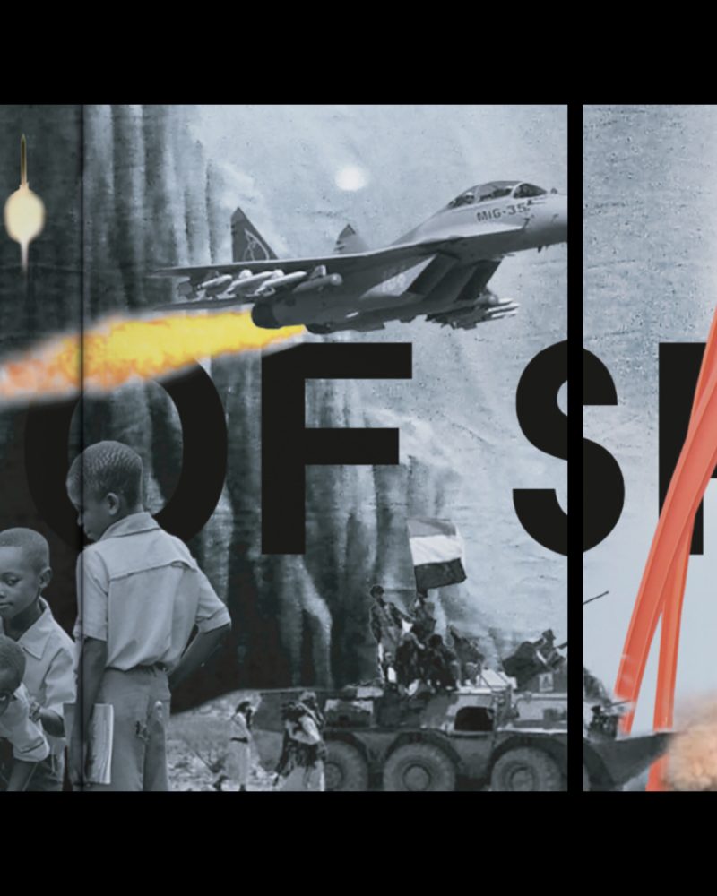


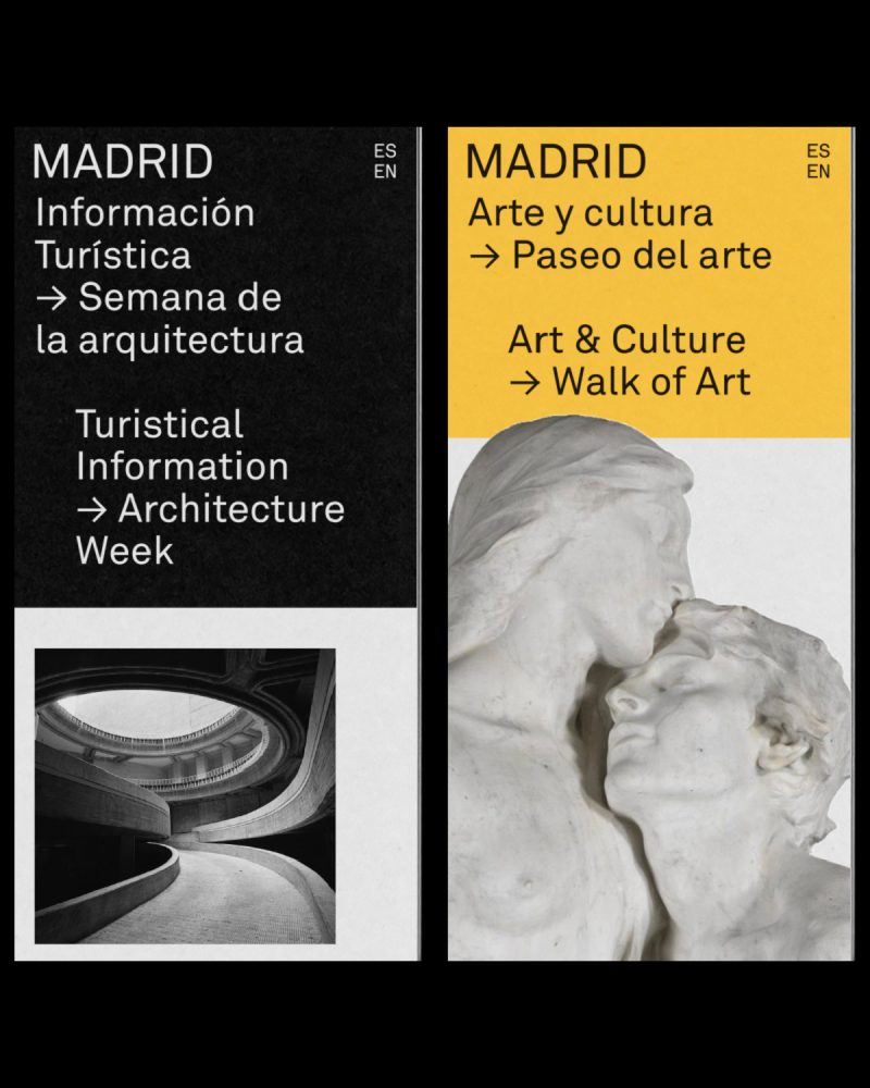

Development of the new graphic system for the tourist communication tools of the city of MADRID. The proposal for MADRID DESTINO aims to make MADRID a contemporary, modern and global city.


Nowadays, a city should not only represent its context, it should act like a cultural urban nucleus for people who come and go, who move, who live in the world. There are no borders. MADRID is a cultural city for people around the city who move forward and push it to be a global and international city. The image who represents this city needs to be global instead of local and represent the moment we are living in.


The identity is made out of different schemes and structures creating a new graphic identity; a perfect balance between image, color and text. A functional system that coexists with all different formats being adaptable, but always keeping its essence.


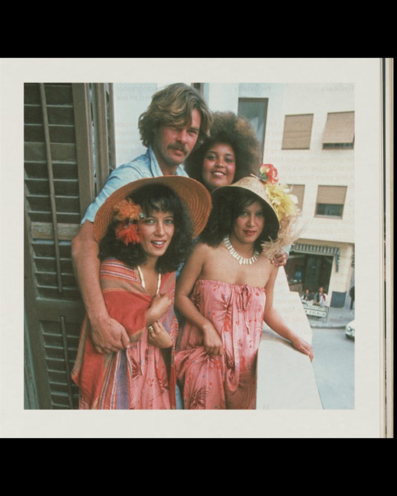
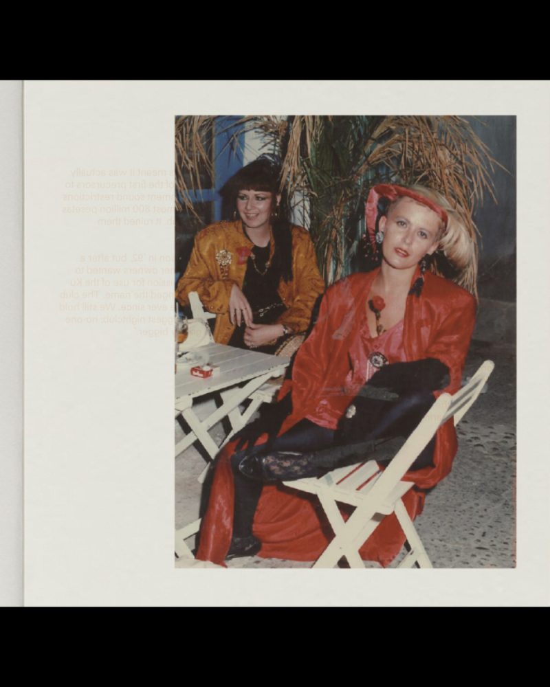
Graphic concept, art direction and editorial design for the IBIZA guide of LOEWE PAULA'S IBIZA collection; a piece that includes an editorial publication and a limited edition vinyl. LOEWE "CLOSE TO PARADISE" is a unique guide that invites people to rediscover – and dance the night away to – IBIZA's eminent energy; illustrated with photographs from the 60s, 70s and 80s alongside with audio interviews of notable inhabitants.


SOULWAX, the electronic and alternative band originally from BELGIUM and led by brothers DAVID and STEPHEN DEWAELE were in charge to write and produce LOEWE "CLOSE TO PARADISE" vinyl with the unconditional support of MICHEL GAUBERT as curator, one of the fashion's leading sound directors.

LOEWE "CLOSE TO PARADISE" guide is a recap of most iconic island's personalities from 60s, 70s, 80s decades what includes reference places of IBIZA and conversation with most influential habitants as RICARDO URGELL, ROSSETA MONTENEGRO, ARMIN HEINEMANN, TONI RIERA, ANNA MARÍA RICÓ or TONY PIKES among others. A guide that works as a vinyl booklet creating a connection between both pieces.