


New identity website design for LIGHTHOUSE, a full-service film and photography production agency that also represents industry talents and artists.

In the new LIGHTHOUSE web identity, the use of the logo typography has become the main typography. This display font provides character and own voice to the production and artist management company founded by EDUARDO SAYAS.
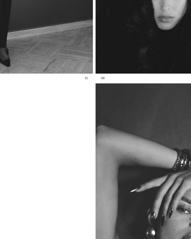

One of the objectives has been to value, visually, the narrative in the LIGHTHOUSE proposals and projects. For this, resources and compositional elements from the publishing world have been used, specifically fashion magazines: the date, numbering, credits, the incorporation of highlights or the use of italics.

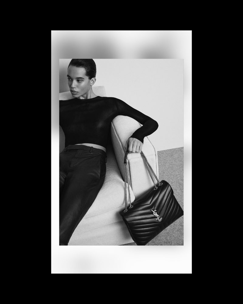
In the project, the name of LIGHTHOUSE as the light that illuminates the path to bring any project to a successful conclusion. On the other hand, lighting is inherent to photography and the audiovisual world, areas of work of this production company and representation agency. To make it happen, light has been associated with the effects of the new web identity such as blurs or flashes. In addition, the cursor is a spotlight or flashlight that guides the user in web browsing.
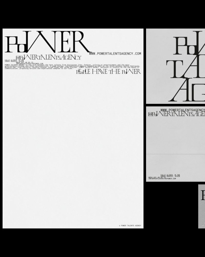


Visual identity design for POWER TALENTS AGENCY under the umbrella concept of the union. This game changer representation agency is the link between talents from different disciplines related to fashion, culture or entertainment and the main international brands and other personalities.


To graphically represent the union, link or nexus that characterizes POWER TALENTS AGENCY, there is no line spacing: images and paragraphs are always joined together creating blocks.


POWER TALENTS AGENY and its visual identity must seduce and communicate a diverse audience by uniting the classic and contemporary. For this, a custom font has been designed: LINK DISPLAY.


Starting from the serif typography that appears on the original cover of the single PEOPLE HAVE THE POWER by PATTI SMITH and the use of small caps, the characters have been modified based on the theory and iconic work of HERB LUBALIN: adding, for example, ligatures and alternative characters.
They believe in talents as the new means of communication, proposing actions and experiences adapted to our time: PEOPLE HAVE THE POWER.


The POWER TALENTS AGENCY website is characterized by the union of an exaggerated, risky and genuine aesthetic capable of organizing information in a clear and orderly manner.


The link, in harmony, between the excess of information, texts and images without line spacing, and empty spaces is present in the new website. A contrast present throughout the visual identity of the project.
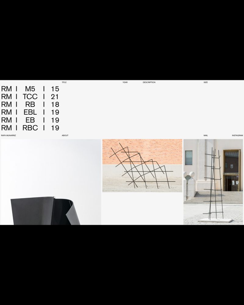


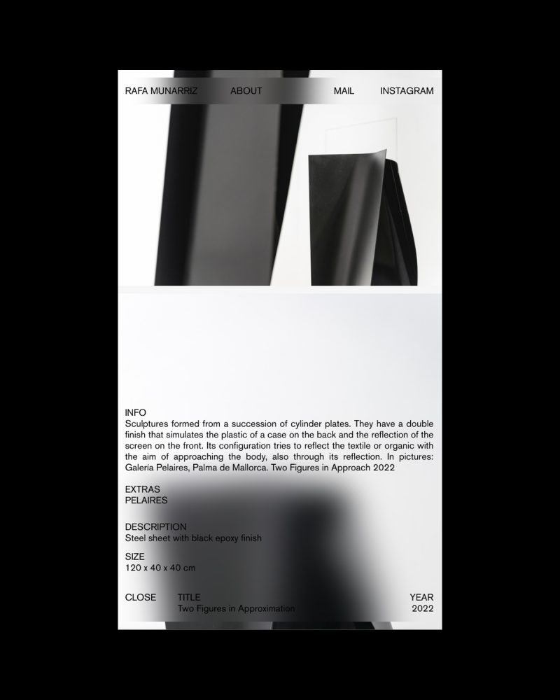


Website design for the artist RAFA MUNÁRRIZ, a project that extends the identity from the editorial project: ESPACIO RELATIVO. The site is conceived as a frame without background, where everything is content.

The project is treated as yet another of the artist's works. RAFA MUNÁRRIZ composes and organizes his work, creating a living and genuine digital space. Concurrently, the website is also a living retrospective of the artist's career.
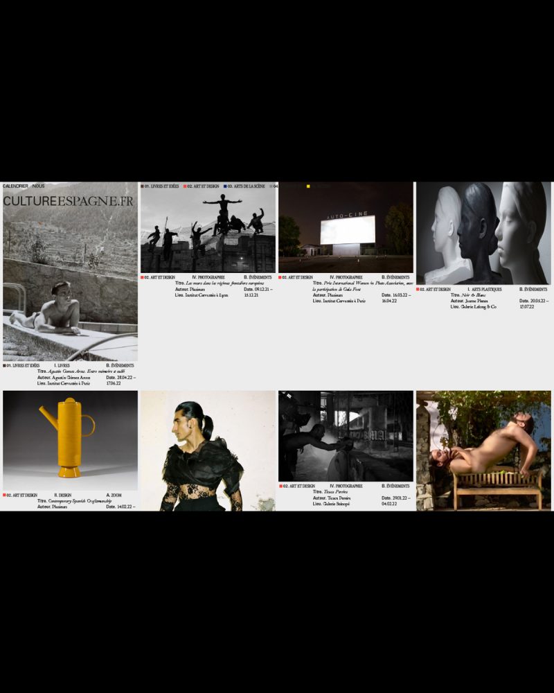
Conceptualization and design of the identity and website of CULTUREESPGANE.FR, a platform for the dissemination of SPANISH cultural and artistic expressions in FRANCE.
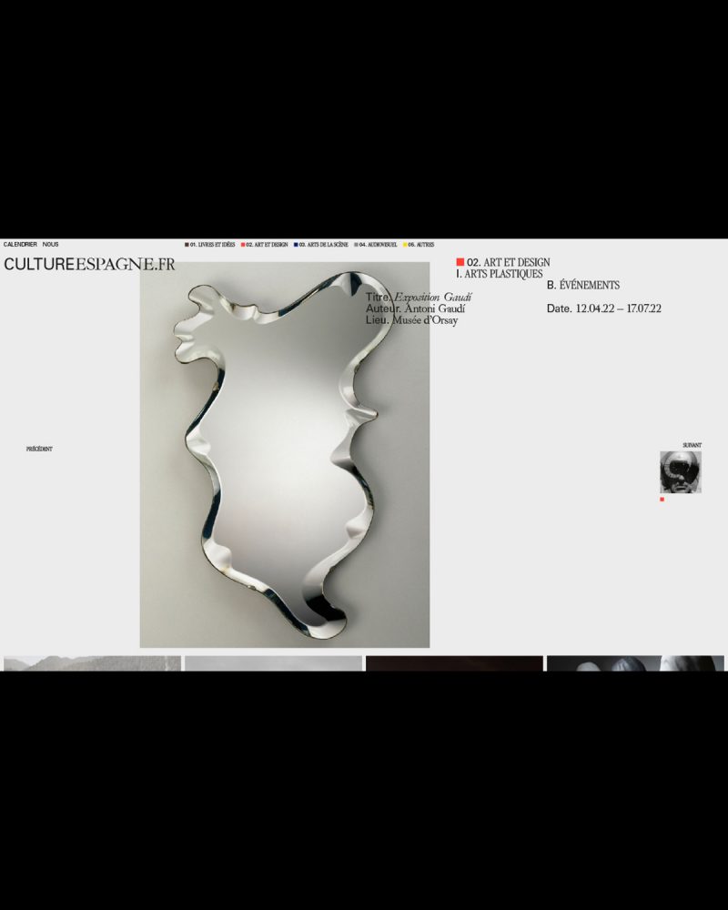


Promoted by the OFFICE CULTUREL DE L'AMBASSADE D'ESPAGNE in FRANCE, which aims to develop and intensify cultural cooperation between FRANCE and SPAIN, CULTUREESPGANE.FR (C.ES.FR) encourages mutual understanding and promotes collaboration and development between the two countries.
Special priority is given to avant-garde SPANISH artistic expression and to the dissemination in FRANCE of SPAIN's emerging artistic production.

For the graphic system and its logo, the union between both countries and its connection with the world of art and culture is proposed thanks to the use of 3 fonts: IBARRA REAL (SPAIN), GARAMOND (FRANCE) and UNIVERS (CULTURE).


Identity design and online presence for DIGITAL VISUAL STUDIES (#DigitalVisualStudies @uzh.ch). A new website for a 5-year cross-institutional DIGITAL HUMANITIES project promoting multidisciplinary research at the intersection of VISUAL CULTURE and COMPUTER SCIENCE.


Funded by the MAX PLANCK SOCIETY and hosted by the UNIVERSITY OF ZURICK, DIGITAL VISUAL STUDIES is tightly connected with a first-rate national and international network of partner institutions and digital initiatives and seeks to generate avant-garde research and methodological, technical and intellectual innovation.
Design, in collaboration with JOHANNA JASKOWSKA an IG Stories Filter for a TOMMY HILFIGER international release.


Using TOMMY HILFIGER's corporate colors, red and blue, in combination with black; the two variations impact intense filter play with light, contrast and intensity to reflect the values of the fragrance.


Design of the online edit for ZARA MAN SPRING SUMMER 2020 ACTIVE UTILITY. It is a capsule collection of modern pieces of smart wardrobe staples that combines sophistication and function. Created for a constantly on the move world citizen.


HERMÈS JEWELRY: BLACK TO LIGHT collection combines black stones and gold to create a very unique collection. The graphic system is based in the concept of how light is born from darkness.


Design and development of the website under the concept LOEWE "PAST, PRESENT, FUTURE" of the brand: more than a website, "a hub for everything".


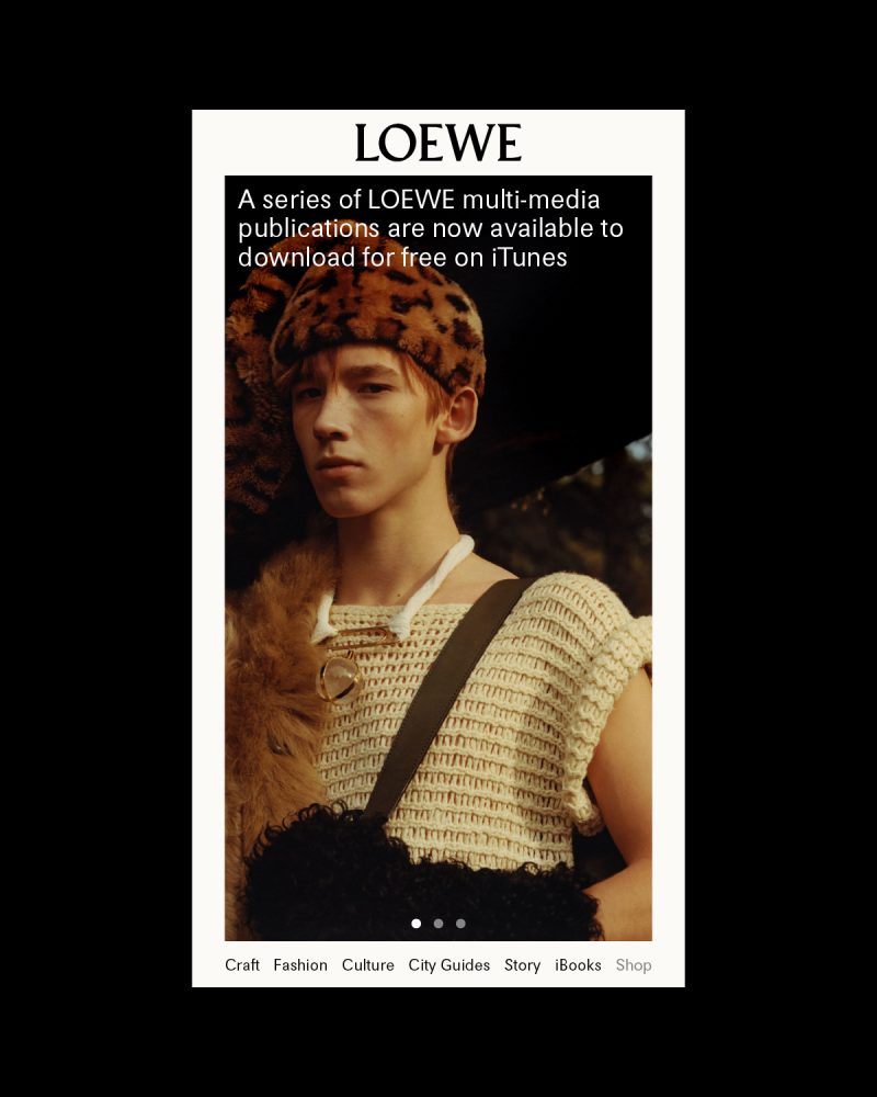

The website emerges as a platform intended to expand the contents of LOEWE.com but without competing with it and creating a dynamic and modular structure that compiles visual content from the LOEWE "PAST, PRESENT, FUTURE" universe.