


New identity website design for LIGHTHOUSE, a full-service film and photography production agency that also represents industry talents and artists.

In the new LIGHTHOUSE web identity, the use of the logo typography has become the main typography. This display font provides character and own voice to the production and artist management company founded by EDUARDO SAYAS.
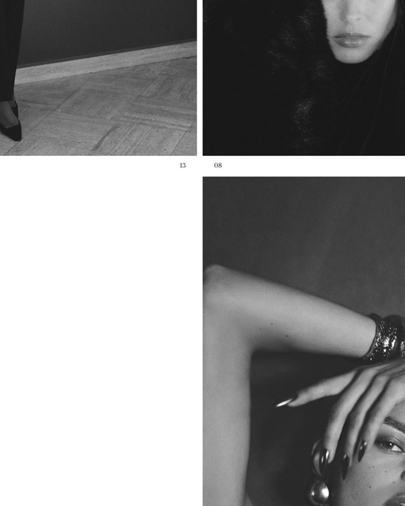

One of the objectives has been to value, visually, the narrative in the LIGHTHOUSE proposals and projects. For this, resources and compositional elements from the publishing world have been used, specifically fashion magazines: the date, numbering, credits, the incorporation of highlights or the use of italics.

In the project, the name of LIGHTHOUSE as the light that illuminates the path to bring any project to a successful conclusion. On the other hand, lighting is inherent to photography and the audiovisual world, areas of work of this production company and representation agency. To make it happen, light has been associated with the effects of the new web identity such as blurs or flashes. In addition, the cursor is a spotlight or flashlight that guides the user in web browsing.
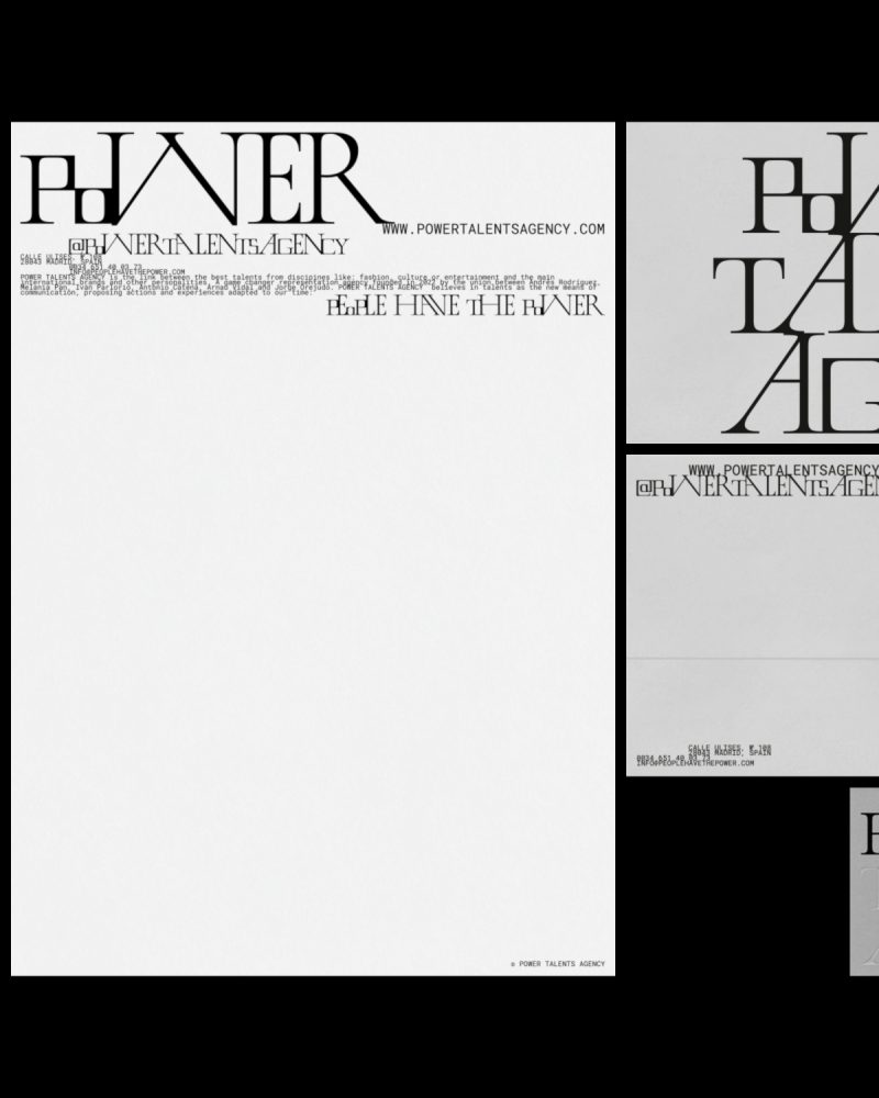


Visual identity design for POWER TALENTS AGENCY under the umbrella concept of the union. This game changer representation agency is the link between talents from different disciplines related to fashion, culture or entertainment and the main international brands and other personalities.


To graphically represent the union, link or nexus that characterizes POWER TALENTS AGENCY, there is no line spacing: images and paragraphs are always joined together creating blocks.


POWER TALENTS AGENY and its visual identity must seduce and communicate a diverse audience by uniting the classic and contemporary. For this, a custom font has been designed: LINK DISPLAY.


Starting from the serif typography that appears on the original cover of the single PEOPLE HAVE THE POWER by PATTI SMITH and the use of small caps, the characters have been modified based on the theory and iconic work of HERB LUBALIN: adding, for example, ligatures and alternative characters.
They believe in talents as the new means of communication, proposing actions and experiences adapted to our time: PEOPLE HAVE THE POWER.


The POWER TALENTS AGENCY website is characterized by the union of an exaggerated, risky and genuine aesthetic capable of organizing information in a clear and orderly manner.


The link, in harmony, between the excess of information, texts and images without line spacing, and empty spaces is present in the new website. A contrast present throughout the visual identity of the project.


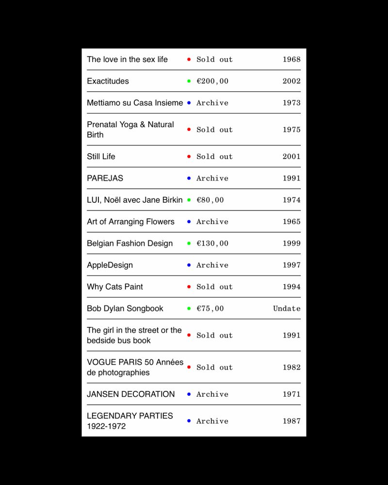
New visual identity design of FAW BOOKS under the umbrella concept of rare; understood as something unusual, peculiar or exceptional. FAW BOOKS is a SPAIN-based independent project that aims at stimulating ideas, concepts and reflections around books. The initiative encompasses a wide range of areas and activities including a bookroom, archive and e-shop.
Quality is a value that defines FAW BOOKS and its archive. Each book or publication, carefully selected, is an attractive, seductive object with a cultural or artistic value. The new FAW BOOKS logo must convey this added value, the quality seal that characterizes it. For this, a "signature" has been designed that unites two graphic elements: the logo and the monogram.
The logogram, like the services offered by FAW BOOKS, is a flexible element; able to adapt to all formats and needs, both physical and digital. As a result, the visual identity has infinite logograms.

In addition to a flexible logogram, the FAW BOOKS visual identity emphasizes other values that make the project unique.
To organize the extensive archive, FAW BOOKS identity gives prominence to a nomenclature system that allows all books and publications to be named with a unique code that identifies and classifies them thanks to three blocks: category, entry number and publication initials. A functional system that also makes the identity more attractive.


FAW BOOKS is much more than an e-shop where you can find a careful selection of used, rare books and other publications that are characterized by their influence on society and their ability to generate new conversations or content.
The project offers consultancy, lending, educational programs, organization of personal libraries, and personalized search/investigation service. In addition, they collaborate with institutions, companies or simply individuals. Therefore, the new FAW BOOKS website must seduce buyers but also give visibility to all offline services. In short, show FAW BOOKS in its entirety.
The FAW BOOKS website recovers own resources from the publishing world. The indexes are the reference to design a "content tree" system that organizes all the information: from the menu to the search filters or the view mode.


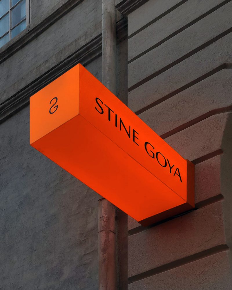
Rebranding for STINE GOYA. a creative process of two years of work that has included, among other things, the design of RISE. A custom typography for the logo and communication of the DANISH fashion brand and a monogram that is also present in clothing and accessories.
For the STINE GOYA's monogram, the work focuses on the union of the "S" and the "G" to create a contemporary form. The result is a recognizable icon that unites both letters in an abstract, organic, elegant and sexy way.


"…as a brand with a voice, we have an obligation to use that voice for good, to help contribute to a more ethical,… " STINE GOYA is known for constantly communicating with her community: HOUSE OF GOYA.
Therefore, everyone has a specific voice. For this reason, this value is associated with a graphic resource that has a specific personality, capable of contributing that recognizable and unique value to the project. Designing a typography specifically for STINE GOYA is the graphic solution to give personality to this voice. Any word or message is instantly recognizable.
HUMANIST fonts are the starting point to create this new typeface. RISE FONT is the result of an exercise that aims to create something new and unique inspired in the past. A meticulous work where decorations are removed to create a cleaner, sharper and more direct voice.


On the other hand, the several ligatures between characters show the union between STINE GOYA and its community. For this reason, the use of ligatures between glyphs is especially relevant in the pieces linked to HOUSE OF GOYA.


In the garments of this DANISH brand, the color and the unique patterns are inspired by the worlds of design and art. Each collection is built with a solid narrative that is based on a concept and a universe of references. Therefore, creativity is the main strength of STINE GOYA and the rebranding's umbrella concept.
"Our collections and DNA stand for fierce individuality and freedom. Be yourself." STINE GOYA wants her audience to be FREE, to be able to express themselves. Without restrictions.This is a concept inherent to the brand and its community: HOUSE OF GOYA. Therefore, it is a value that must be reflected.
To illustrate the freedom associated to composition, the new identity communicates through visual poems inspired by the work of artists like VICENTE HUIDOBRO, ED RUSCHA or LAWRENCE WEINER.


"…Our goal is to inject joy and fearless confidence into the lives of our audience." Like STINE GOYA, N-E believes that color has the power to transmit emotions, and also to improve our experiences.
For this reason, orange is the color for STINE GOYA, a tone that communicates the value of joy. Under the umbrella of art and creativity, the inspiration also comes from the work of great artists to find the specific corporate color.
In this case, the reference is LE CORBUSIER's architectural colour theory published in 1931: ARCHITECTURAL POLYCHROMY. A catalog in order to create harmony between colors by creating combinations that affect human emotions. For him, this choice "is bright, a dynamic orange. Young and optimistic".
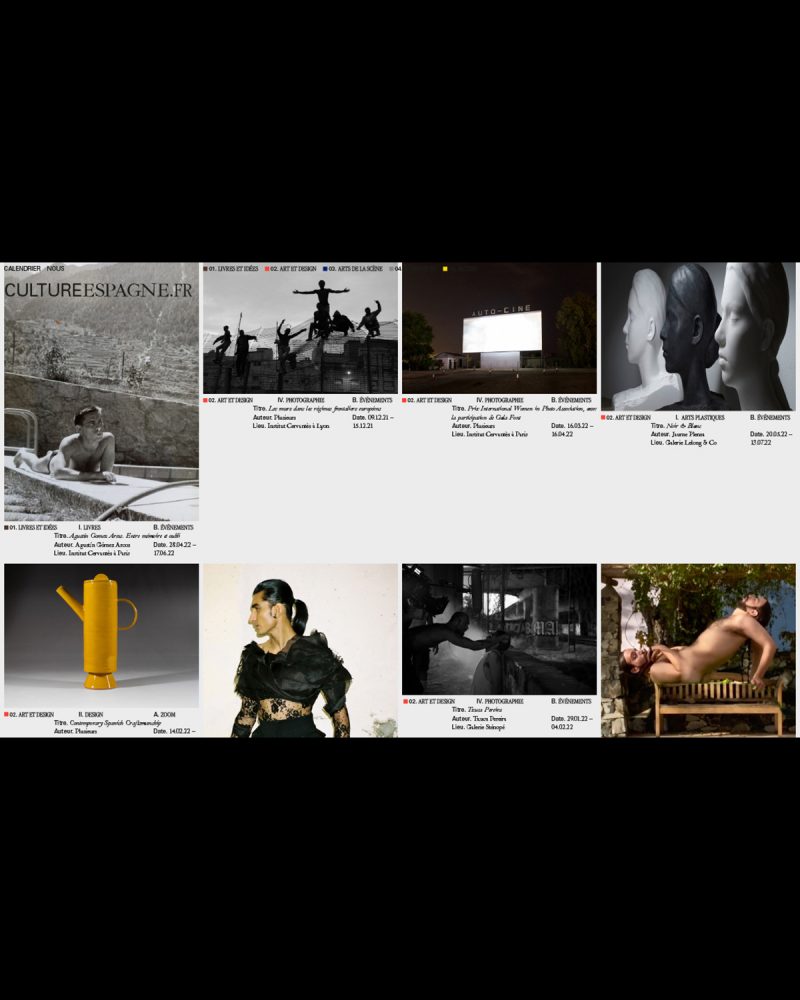
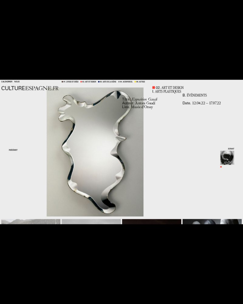
Conceptualization and design of the identity and website of CULTUREESPGANE.FR, a platform for the dissemination of SPANISH cultural and artistic expressions in FRANCE.


Promoted by the OFFICE CULTUREL DE L'AMBASSADE D'ESPAGNE in FRANCE, which aims to develop and intensify cultural cooperation between FRANCE and SPAIN, CULTUREESPGANE.FR (C.ES.FR) encourages mutual understanding and promotes collaboration and development between the two countries.
Special priority is given to avant-garde SPANISH artistic expression and to the dissemination in FRANCE of SPAIN's emerging artistic production.

For the graphic system and its logo, the union between both countries and its connection with the world of art and culture is proposed thanks to the use of 3 fonts: IBARRA REAL (SPAIN), GARAMOND (FRANCE) and UNIVERS (CULTURE).


Identity design and online presence for DIGITAL VISUAL STUDIES (#DigitalVisualStudies @uzh.ch). A new website for a 5-year cross-institutional DIGITAL HUMANITIES project promoting multidisciplinary research at the intersection of VISUAL CULTURE and COMPUTER SCIENCE.


Funded by the MAX PLANCK SOCIETY and hosted by the UNIVERSITY OF ZURICK, DIGITAL VISUAL STUDIES is tightly connected with a first-rate national and international network of partner institutions and digital initiatives and seeks to generate avant-garde research and methodological, technical and intellectual innovation.


Design of DANCASSAB‘s new corporate identity. The pieces have messages that are addressed to the buyer using always the SINERGIA typography, a font specially designed for the brand.


Handmade in MEXICO, DANCASSAB designs leather garments of bespoke quality and timeless appeal. They are built to be passed down, and loved through generations.
The new SINERGIA typography reflects some of the brand's values, including the balance between timeless and unique. To do this, the shapes of two of the most iconic fonts, TIMES NEW ROMAN and HELVETICA, were united to achieve an eclectic but harmonious result.


Design of the new packaging for DANCASSAB's (@dancassab) new corporative identity. The pieces have messages that are addressed to the buyer using always the SINERGIA typography, a font specially designed for the brand.
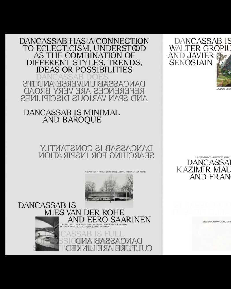


Writing texts and design for the manifesto of DANCASSAB's new corporative identity. A publication that reflects the designer's imaginary in many messages and images. An eclectic universe where opposites coexist in harmony.


Design of some posters for DANCASSAB's SS22 campaign. The new corporative identity and the SINERGIA typography, a font that reflects some of the brand's values, including the balance between timeless and unique.