


For the launch of the new visual identity of FAW BOOKS, N-E has designed three corporate posters illustrated with the logo and images of GERAY MENA. Emphasizing the umbrella concept, rare, the project shows itself in a seductive, attractive, romantic and mysterious way.


The concept tries to show the editorial publications of FAW BOOKS as common objects present in our lives. GERAY MENA turns images into narrative key visuals full of layers. As ROLAND BARTHES pointed out, a work of art should be like an onion; the context and clues to hidden concepts can only be understood by spending time looking at the work over and over again. From the complete image to the still lives and details.


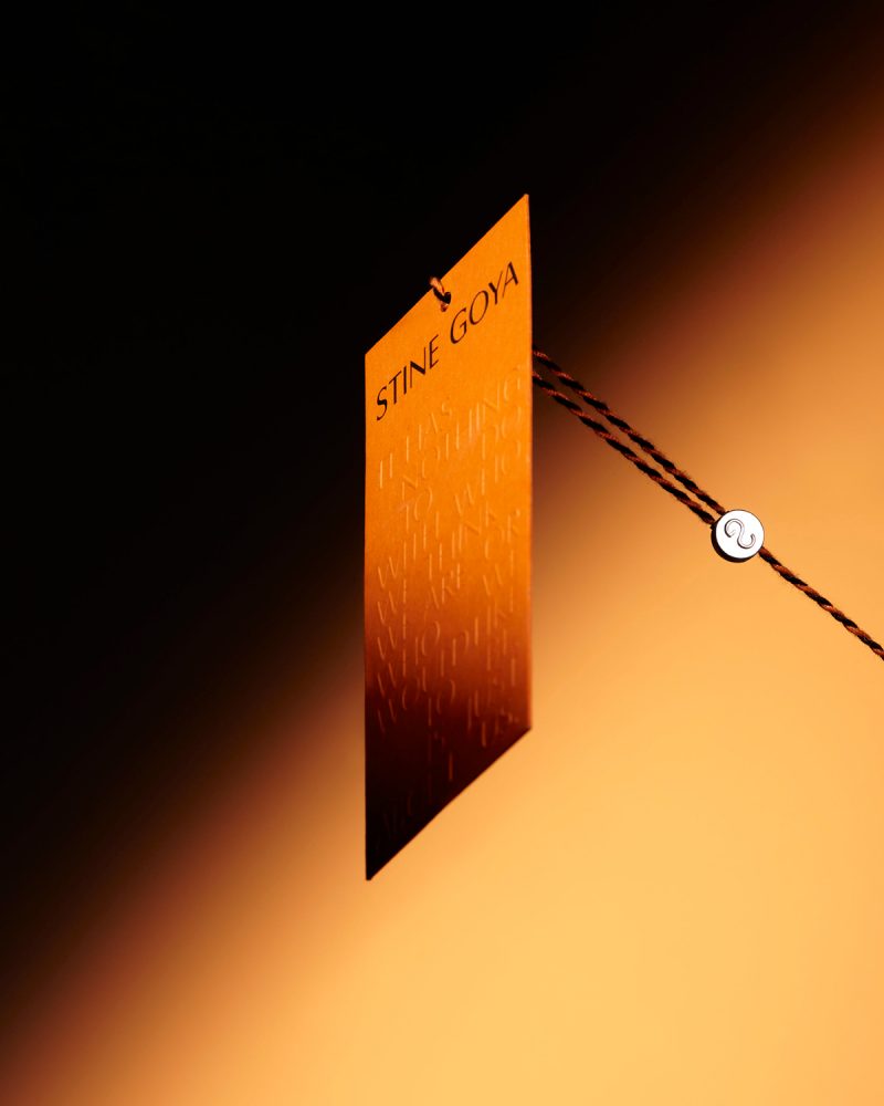
Rebranding for STINE GOYA, a creative process of two years that has included, among other things, the design of RISE, a custom typography for the logo and communication of the DANISH fashion brand and a monogram that is also present in clothing and accessories.


The MAGABOOK ADG Laus Awards is a publication or, more specifically, a yearbook that compiles the best creative projects in the field of graphic design over the course of a year. From N-E, we go one step further, designing something that is closer to an object and that provides an experience: a box that must be discovered. Thought as "something to keep", the user is forced to dedicate some time to the project, which is still an editorial project.


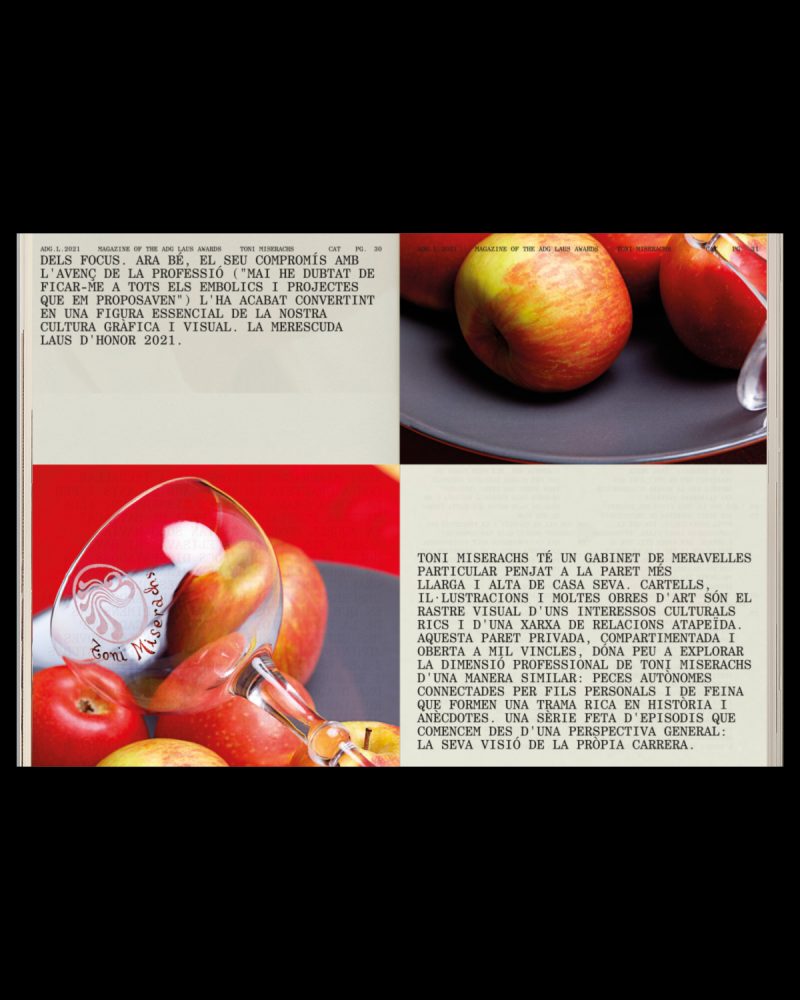
We live in an era where the digital world and the physycal coexist and are increasingly connected. Objects, even through a screen, are still relevant and define us as individuals. This is what GEORGES PEREC tells in his book "LES CHOSES" (1965). Following this discourse, GERAY MENA has collaborated in this project portraying TONI MISERACHS, LAUS DE HONOR AWARD 2021, through them. The images show some details such as earrings or a watch next to other objects that are relevant describing her personality.


From N-E, we developed the MAGABOOK ADG LAUS AWARDS 2021 as a reflection of our time and, therefore, we have rethought the format from its foundation. We are talking about a period in which we have been forced to adapt to new scenarios, rethink the way we work and change the way we interact. A new context where some aspects have been accentuated such as the duality between digital and physical. This sense of bewilderment in the face of a new reality is reflected in the proposal: the reader faces a graphic abyss; must adapt and understand the new codes and rules of MAGABOOK 2021.
The relationship with time is present throughout the project. For this, we have been greatly inspired, both graphic and conceptually, by the work of ON KAWARA (1932-2014). This JAPANESE conceptual artist addressed throughout his life the idea of time and how it passes; showing how it can go beyond and reduce historical experience.
The MAGABOOK project is divided into two publications: the book and the magazine. They relate to the works "DATE PAINTINGS" for the digital part and with "ONE MILLION YEARS" for the design of a publication that aims, in a way, to archivetime.


The link between physical and digital worlds is especially reflected in the THE ADG LAUS AWARDS 2021. This publication has been renewed over the years thanks to the work of different studios, incorporating groundbreaking elements that we have inherited in order to create a new concept where the barrier between the physical and digital disappears. In this way, a 360º experience is created. The book presents the winning projects, for the first time, without images.
Next to the information of each winner, a QR code appears. An element that seemed obsolete but that, in this new context, has returned to our daily lives. The QR are the nexus between the physical part and the digital. Being faithful to the will of reflecting our time, we have created an Instagram accountwhere the images of all the winnersappear. In this way, the reader can interact with the publication: comment on it, share it or save it as a reference.
The feed design of the INSTAGRAM account is inspired by the work "DATE PAINTINGS" (1966-2013) by ON KAWARA. For almost 50 years, the artist documented numerous dates on a monochromatic canvas painted in shades of red, blue or gray. On it, he wrote in white the date of the day on which it was painted.


In a project where time is the umbrella concept, the two publications of the MAGABOOK ADG LAUS 2021 are treated as a long timeline, a kind of parchment or ticket. In this way, we break the classic structure of the book by eliminating covers; the content is cut at the bottom of the page and continues on the next one seamlessly. The pages reflect a routine in which every day is the same and, in turn, different.
The MAGABOOK ADG LAUS 2021 is the part that contains interviews and articles, a content designed to be read. From N-E, we believe that the human being continues to feel more comfortable consuming this type of content in physical format.
Although in both parts of the magabook, monospaced fonts are used, for the magazine we chose the CENTURY SCHOOLBOOK MONOSPACED. It is a serif typeface that gives the publication a more editorial character. In contrast, for the book we picked APERCU PRO MONO. In addition to being one of the studio's corporate typefaces, thus leaving a small "easter egg" in the project, it is a sans serif font that is used to collect data.